
How to Make a Sign Readable and Effective

If you're a business owner, then you know how important it is to make a good impression on potential customers. One way to do that is by using signs to advertise your business.
Properly designed, well-made and creative business signage is capable of catching the attention of people passing by and enticing them to stop at your storefront to read about what you have advertised.
There are a few things you can do to make sure your sign reaches potential customers and gets your message across. Here are some tips for making your sign the best it can be.
If you’re ready to create an eye-catching and informative sign for your business, keep reading!
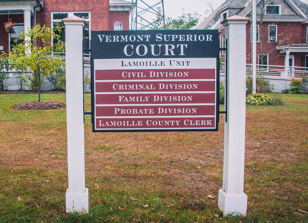
Choose the Perfect Size

When it comes to choosing a size for your sign, think about where it will be placed and how far away people will be from it. There's nothing more frustrating than trying to read a sign that's too small. You squint and strain your eyes, but all you can make out is a blur.
Or maybe you can read the words, but they're so crammed together that it's difficult to process the information. Either way, it's a frustrating experience. Luckily, it’s one mistake that you can easily avoid by making sure your signs are the right size.
But what exactly is the right size? That depends on a few factors, including the distance at which the sign will be viewed and the amount of text. As a general rule of thumb, you should aim for letters that are at least 1 inch tall for every 10 feet of distance.
If you're putting up a storefront sign, for example, you'll want to make sure it's big enough to be seen from the street. If people can’t see it, they won’t be able to read it. On the other hand, if you're placing a sign in your office lobby, you don't want it to be as large.
Of course, there's more to effective signage than just size -- the layout and design are also important. But if you start with the right size, you'll be well on your way to creating a sign that's easy to read and hard to ignore.
Keep it Simple
Signs are a necessary part of your business. They provide guidance and direction in a variety of settings, from retail stores to office buildings to outdoor recreation areas. While signs come in all shapes and sizes, there is one important commonality that all effective signs share: simplicity.
A sign that is too busy or cluttered will be difficult to read and understand, defeating the purpose of the sign entirely. On the other hand, a sign that is well-designed and uncluttered will be easy to read and effective in conveying its message.
You should avoid using:
- Jargon or technical terms that not everyone will understand.
- Too much text because it can be overwhelming.
- Too many graphics or images with clashing styles.
Stick to the essentials and you'll be more effective. This will help ensure that there are no mistakes that could confuse readers.
Use Clear Font Types
A sign is only as good as its font. After all, if people can't read your sign, then it might as well not be there at all. So how do you choose the right font for your sign?
You need to consider the purpose of the sign. Is it supposed to be easy to read from a distance? If so, then you'll want to use a sans serif font like Roboto or Arial. These fonts are designed to be easy to read even when they're not printed in large size.
However, if you're looking for a more ornate font, then a serif font like Georgia might be a better choice. Whichever font you choose, make sure that it's clear and easy to read. Otherwise, your sign will be ineffective.
If you want people to stop and take notice, use an attention-grabbing font. If you want people to feel calm and relaxed, use a softer font like Josephin. By taking all of these factors into account, you can choose the best font for your particular sign.
Use Clear and Concise Language

You need to make sure that your message is easy to understand and that it stands out from all the other signs out there. That's why it's important to use clear and concise language when creating a sign for your business.
Having an effective sign is important if you want people to actually read it. But achieving this goal is easier said than done. After all, there's a lot of competition for people's attention these days.
As a business owner, you want potential customers to learn about your services instead of just walking right on by. So, next time you're thinking about making a sign, remember to keep it short and sweet. That way, you'll have a much better chance of getting your point across.
Consider Text and Background Color

Make sure the background color contrasts well with the text color so that the sign is easy to read. Black or dark-colored text is always the most readable, so that's a good place to start.
If you're looking for something a little more eye-catching, you can try using a light-colored text on a dark background. Just be sure to use a high-contrast combination so that your text is still easy to read.
As for background color, again, you'll want to choose something that provides high contrast with your text color. Light-colored backgrounds tend to work well with dark-colored text, while dark backgrounds are better suited for light-colored text.
With careful consideration of color, you're already on your way to having an amazing sign that easily communicates your business to potential customers.
Use Visuals

Visuals are essential for any sign because they are what will grab attention and communicate the message effectively. Include arrows or other visuals to point out important information or direct people’s attention to a specific area on the sign.
But how do you ensure that your visuals are readable and effective? Here are a few things to keep in mind:
Make sure the contrast is strong enough.
The last thing you want is for your sign to be difficult to read because the colors are too similar. A good rule of thumb is to use light-colored visuals on a dark background, or vice versa.
Think about the size of the visuals.
They should be big enough to be seen from a distance, but not so big that they dominate the sign and make it difficult to read the name of your business and/or other words.
Choose visuals that are easy to understand.
Abstract images may look nice, but if they don't clearly communicate the message of the sign, they're not doing their job. Stick to simple visuals that will get the point across quickly and effectively.
By following these tips, you can create visuals for your sign that are both visually appealing and easy to understand. Don't forget the importance of using high-quality visuals.
Location, Location, Location
Try envisioning your sign in different locations around your store or office to see what works best. You may need to adjust the text size or color depending on where it's placed.
For a custom-made sign, you will need to already know where it is going to be mounted and from how far away it will be read before you order it. That way it can be designed and built to fit your specifications.
Here are a few tips for deciding on the best location:
- Choose a spot where there is plenty of natural light.
- Stand back to where an actual customer would be so you can decide if the sign placement is good from their perspective.
- Make sure the angle of your sign is just right in order to be read by people on the road as well as the sidewalk.
Finding the perfect spot for your sign is going to make the difference between a potential customer reading it or not, so make sure you get it right.
Get Feedback From Others
You've designed the perfect sign. It's succinct, to the point, and maybe even a little witty. But there's just one problem: you're not sure if anyone will actually be able to understand it.
Before you have your sign made, it's important to get some feedback from others to make sure that it's readable and effective. Otherwise, you might just end up with a sign that causes more confusion than it does clarity.
If you're feeling extra confused, take a minute to ask a friend or family member if they can understand your sign before you pull the trigger on having it made. Chances are, they'll be able to tell you whether or not it needs a little work. And who knows? They might even have a few suggestions on how to make it even better.
Put It All Together

An effective sign for your business can help you catch the attention of potential customers and communicate your message. By following this advice, you can be on your way to creating an eye-catching and readable sign for your business.
If you need some help getting started, or want more tips on how to make an effective sign, contact us today!