
7 Spooky Signage Mistakes to Avoid

It's that time of year again! The leaves are changing color, the air is getting crisp, and best of all, Halloween is just around the corner. But before you get too excited about decorating your storefront and passing out candy to trick-or-treaters, there are a few faux pas you'll want to sidestep if you don't want your business efforts to backfire. Here are seven spooky signage mistakes you should avoid:
1. Not Having Signage at All
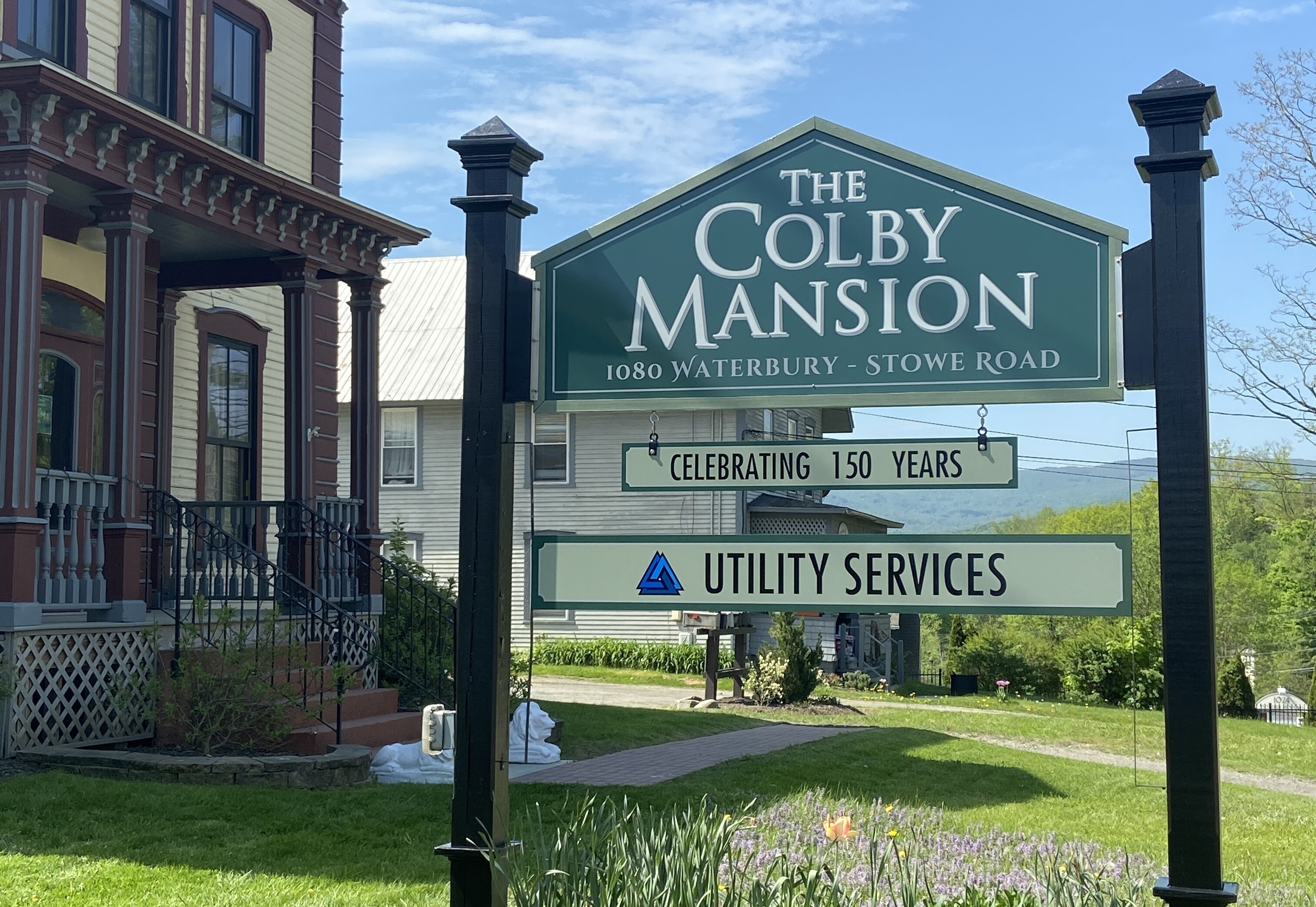
This is a huge mistake! A well-designed sign is one of a business's most important marketing tools. If you don't have signage, you're missing out on a prime opportunity to promote your brand and attract customers. Potential customers may not even know your company exists without signage, so they'll take their business elsewhere.
What kind of signage should you have? The answer depends on your business and your goals. In general, you'll want to create eye-catching signage, easy to read and relevant to your target audience.
2. Misunderstanding Branding
The top priority for any small business owner should be understanding the basics of branding. Without a clear brand identity, your business signage is doomed to fail, (like Charlie Brown's attempt to see The Great Pumpkin!)
Your signage should be an extension of your brand, not an afterthought. The first step in creating effective signage is to develop a clear branding strategy. What are your core values? What message do you want to communicate? Once you have a solid foundation, you can create a signage plan that aligns with your brand identity.
Keep in mind that your signage should be consistent across all channels, from your website to your business cards to your storefront. When done right, branding can make all the difference in the success of your small business. Don't underestimate the importance of getting it right from the start.
3. Using the Wrong Materials

Small business owners have a lot to think about. From finding the right location to hiring employees, there are a million and one things to worry about. However, one avoidable mistake often made is using the wrong materials for business signage.
While it may seem like a small detail, using the wrong material can end up being a costly investment. For example, if you use a cheap plastic sign or temporary banner, it will likely fade or crack over time. This will not only make your business look unprofessional, but it will also require you to replace the sign more often. On the other hand, if you use high-quality materials, your sign will last for many years, saving you money (and headache) in the long term. When designing business signage, be sure to choose wisely and invest in a long-lasting material.
4. Choosing the Wrong Font & Colors
When it comes to business signage, font and color choice can be make-or-break. For one thing, they can influence our mood—whether we realize it or not. The right font and colors can create a cohesive, professional look that will leave customers with a positive impression. However, the wrong font and colors can have the opposite effect, making the signage look messy and unprofessional.
On a subconscious level, we respond positively to complementary colors and easy-to-read letters that are spaced out nicely. This is why businesses should take care to choose fonts and colors that are pleasing to the eye and easy to read. After all, first impressions are important—and signs are often one of the first things potential customers will see when considering doing business with you.
Ultimately, font and color choices should be based on the message you want to communicate and the overall look you want. You can ensure your business signage makes the right impression with careful consideration.
5. Having Too Much Illegible Text
Imagine you're driving down the highway and see a sign for a business up ahead. But instead of the usual logo or slogan, the sign is covered in a flowery cursive writing. You can't make out any letters from this distance, so you keep driving. But then, as you get closer and closer, the letters start to come into focus... and they're all jumbled up! It's like a scene from a bad horror movie, where the letters on the screen are moving around, and you can't make sense of them.
Like those movies, too much illegible text on business signage is frustrating and confusing for potential customers. So take a step back, assess your letter spacing, and make sure your message is clear. Otherwise, you might end up with something that's more trick than treat.
6. Placing Signage in the Wrong Place
Signage is a key marketing tool for businesses, but it only works if it's placed in the right spot. Signs too close to the ground are at risk of being hidden by parked cars, landscaping and snow. Signs that are too far away to read may as well not exist.
The distance between a sign and its intended audience is known as the sign's 'viewing distance,' and it's one of the most important factors to consider when planning your signage. At a minimum, your sign should be visible from twice its height away. So, if your sign is 10 feet tall, it should be visible from at least 20 feet away. Of course, viewing distances will vary depending on the size and type of sign. Keep these guidelines in mind to ensure your business sign will be seen and noticed by the people you want to reach.
7. Not Having Signage Professionally Designed
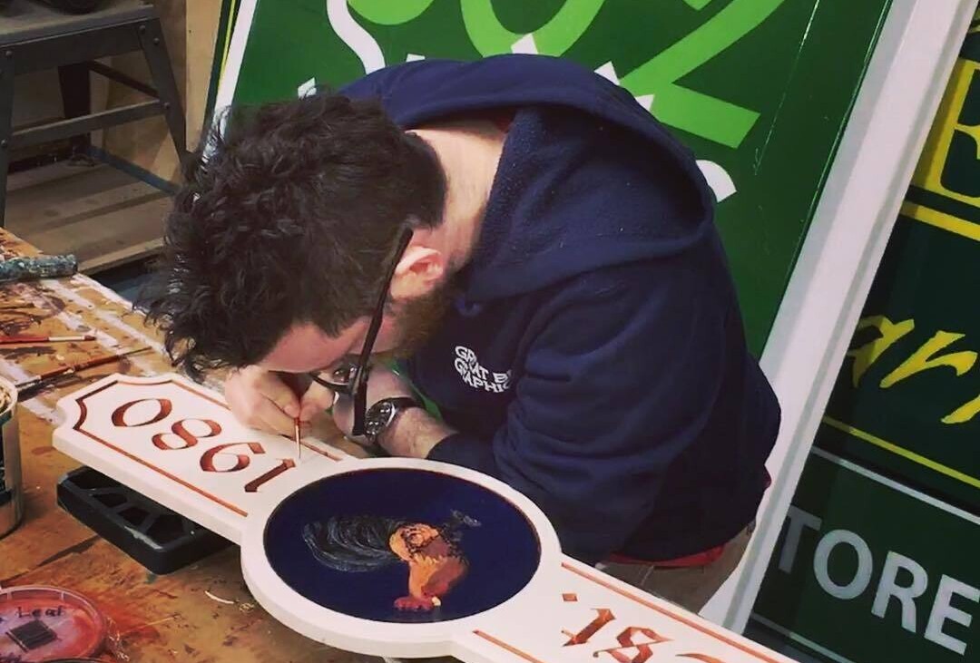
Signage is one of the most important investments a company can make. Many businesses make the mistake of trying to create their own signage. As a result, it usually falls flat and fails to communicate the company's key messages.
It's also worth considering how your company's branding will be affected by your signage. A professional designer will be able to help you create a cohesive look that reflects your company's values and ideas. A professionally designed sign will be focused and targeted, conveying your company's unique ideas and creating an immediate impact.
In today's competitive business world, making a positive first impression is essential, so don't overlook the importance of professional signage design. After all, it could be the difference between success and failure.
Make Sure Your Sign is Spook-tacular!
Halloween is a time for scares, but your signage shouldn't be one of them. To avoid mistakes that could scare away potential customers, work with the pros at Great Big Graphics. Get in touch with us today! We'll make sure your business signs are spook-tacular!