How To Get Your Sign Design Right The First Time
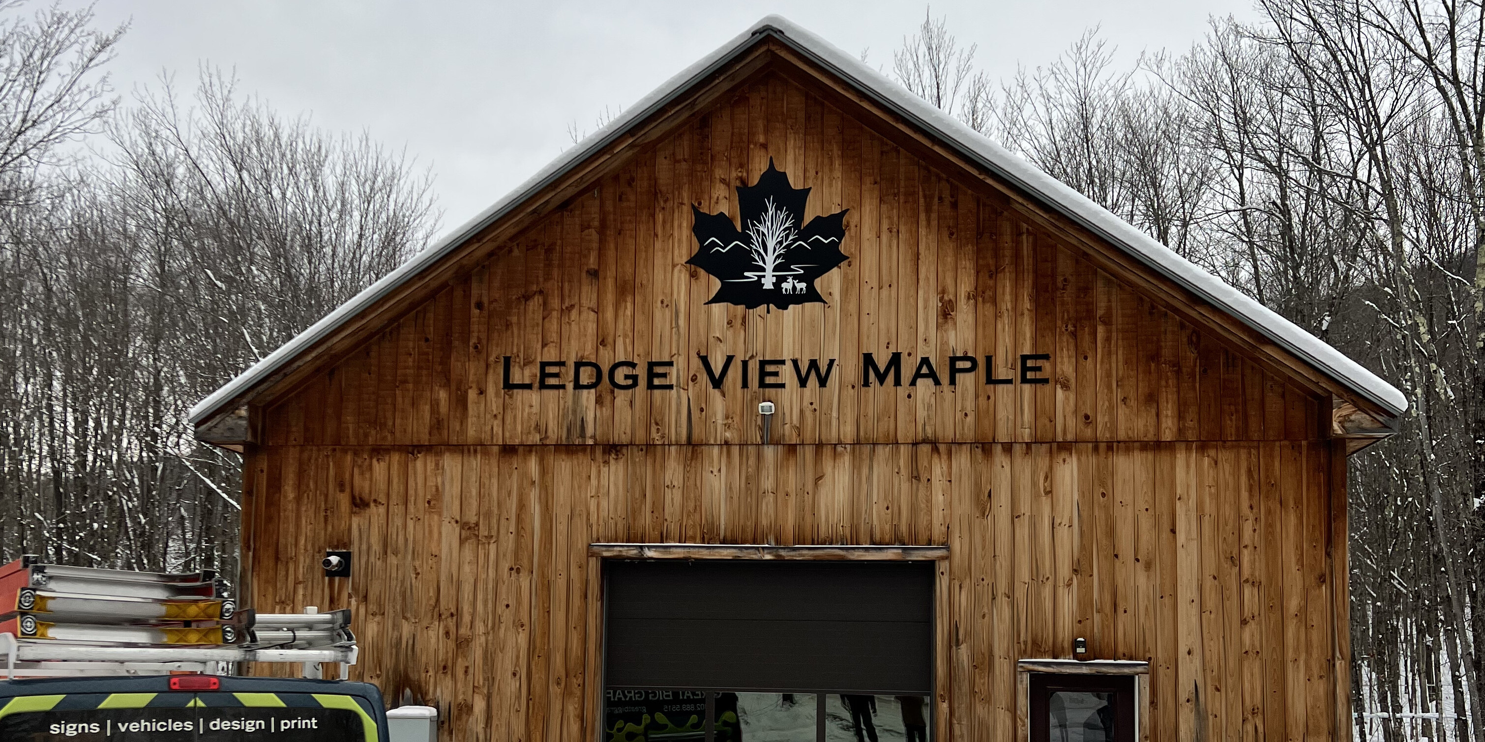
So, you've decided to get a business sign. Excellent idea! A well-designed sign can really help your business stand out.
The importance of signage cannot be understated. It's how you establish your brand, remind people about what makes it special and reinforce everything that makes up who you are as a company.
So if you want to know how to make sure the design is done right the first time, this article is for you!
What To Consider When Designing a Business Sign
Signs are a great way to promote your business, build brand recognition, and attract new customers. However, when designing a business sign, several elements need attention first.
- What's the purpose of the sign? The first step is to identify its purpose. Is it to promote awareness of your business? Is it to direct customers into your store? Is it promoting a special offer or product? The right sign depends on your goals and the message you want to convey to your target audience.
- Who is your target audience? You need to know who you're trying to reach with your sign. When you identify your audience, the next step is to create a sign to appeal to that specific group of people. For example, if you're trying to appeal to a younger crowd, you might want to use a more modern design with vibrant colors and imagery. On the other hand, if you're targeting an older demographic, something a little more traditional might be more effective.
- Where should the sign be placed? A well-placed sign makes all the difference in the world, and the best position will ensure maximum visibility and exposure to potential customers. While not exclusive, signs are typically placed in several locations: the street, in front of your business, on your building, or a billboard/pole sign.
Clearly Communicate Your Business Services
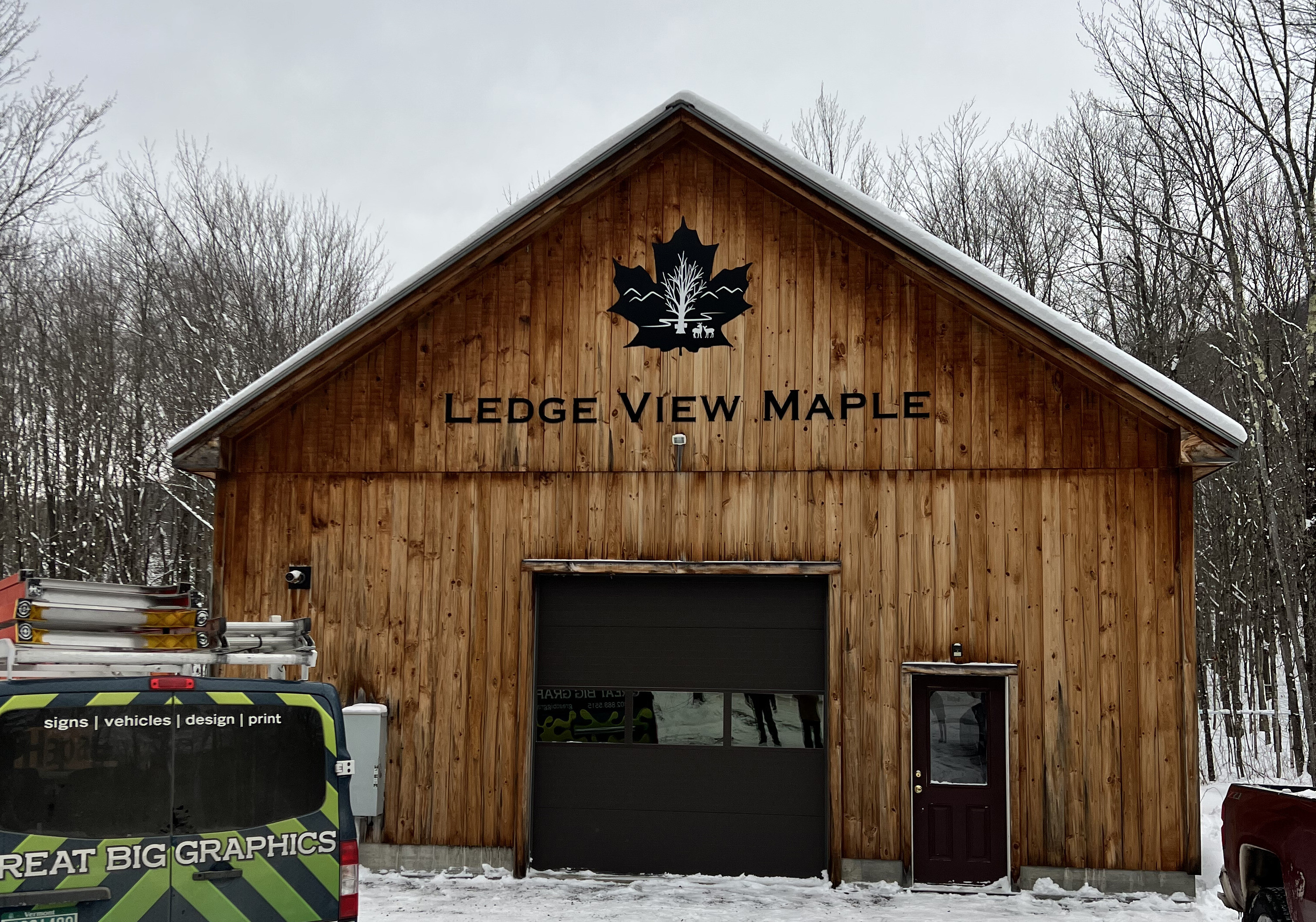
Research shows the importance of signage as a communication tool is undeniable. Although, in order to be effective, it's essential to make sure your messaging is clear because your sign is often the first thing potential customers will see.
Customers should be able to quickly and easily understand what your business offers. If your sign has too much confusing or unclear information, you risk losing potential business.
A study published by Microsoft in 2015 said an adult's average attention span is 9 seconds, similar to that of a goldfish. Whoa, think about that, for 9 seconds. How much were you able to think about in that amount of time? Now imagine a customer driving by your store. How will you get them to stop or remember your business within 9 seconds?
A great sign clearly communicates what your business services are or what products you're selling. This means using language that's easy to understand and accurately reflects what your business does.
The Basics of Sign Design
Keep it simple
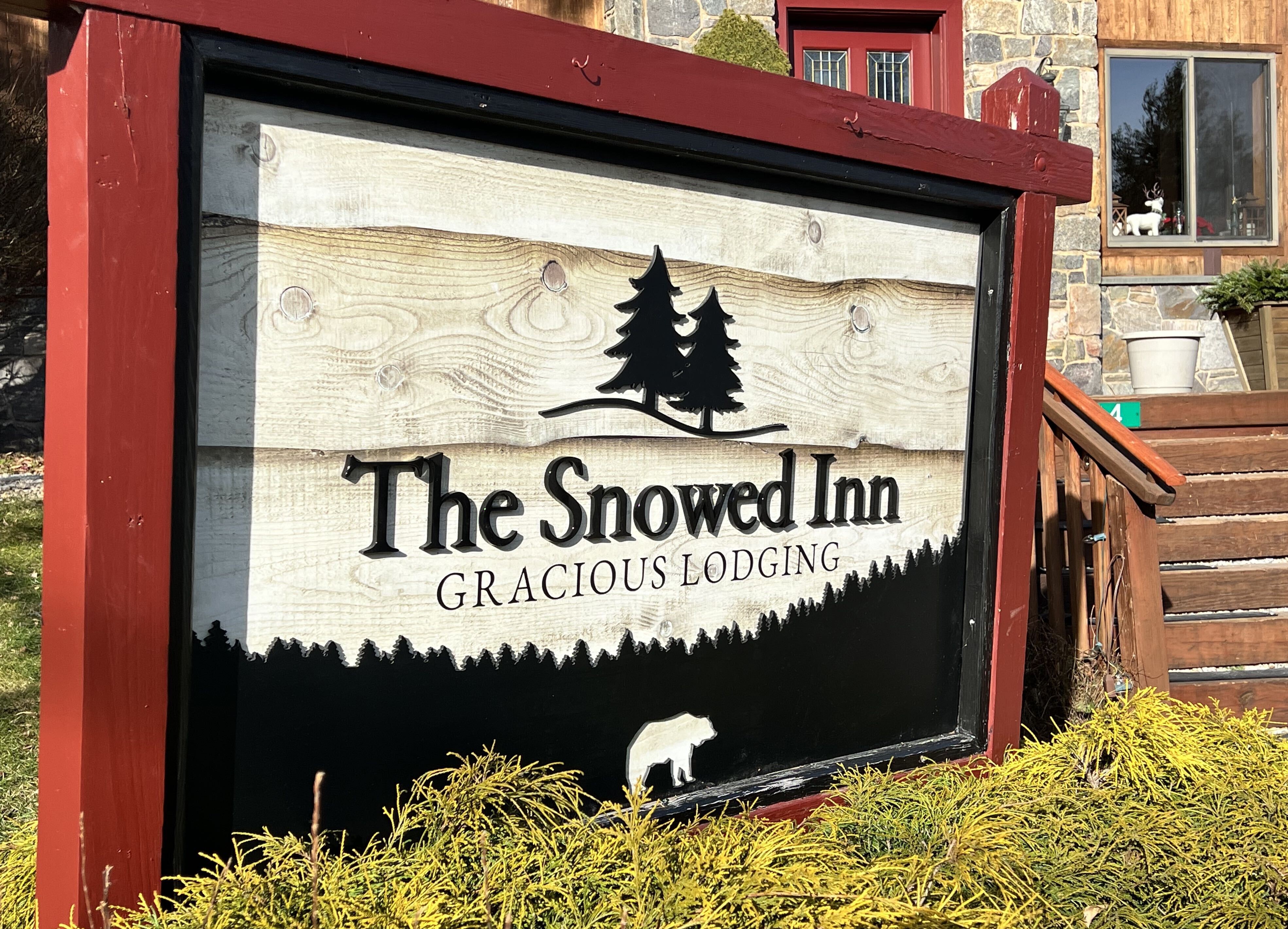
It's often said that good things come in small packages. This is especially true when it comes to sign design. The best signs usually feature simple imagery and text.
Busy, cluttered signs are not only hard on the eyes, but it can also discourage customers. A simple design will be easier for customers to remember, especially when friends or co-workers are looking for recommendations for the service or product you sell. Never underestimate the power of word-of-mouth advertising. Family and friend recommendations are trusted by 92% of individuals!
Use standard fonts
When choosing fonts, keep it simple and stick to the classics. You want your sign to be eye-catching and legible from a long distance.
There are two main font types - Serif and Sans Serif. Let’s do a quick comparison.
Serif fonts are the most familiar font type, and if you’ve ever read a document from a law office, you’ve seen serif fonts. Times New Roman is a classic serif font - the standard law office font - and often a computer’s default font. One way to distinguish serif fonts is they have thick and thin lines. If you look at the individual letter, you’ll notice the tips of the letters have decorative ends. In typography lingo, they’re called “tails” or “feet.”
Sans Serif fonts are more modern fonts. They’re different from serif fonts because they don’t have the decorative end - hence the “sans” (French for “without”). Sans fonts are cleaner in appearance and considered more modern. They’re usually much easier to read. The most common sans serif fonts are “Arial” and “Helvetica.” They’re very similar. Fun fact: Helvetica isn’t included as a default in a Windows operating system. In a Windows computer, the equivalent is Arial.
What font should you use for your business signage? That's entirely dependent on the kinds of media it will be used in and your business's personality. If you're unsure what font to use, Great Big Graphics has the know-how and expertise to advise you on the perfect font for your business!
Use complementary colors

There's a lot to consider when choosing colors for your sign. The color scheme you choose can significantly impact how visible and effective the sign is. One of the best ways to ensure high visibility is to use complementary colors. These color schemes create a high contrast between the foreground and background, making it easier for people to see your sign.
Choose The Right Type Of Sign
When choosing a business sign, consider the type of sign that will be most effective for your business. Some of the most common types of business signs include:
Carved Signs
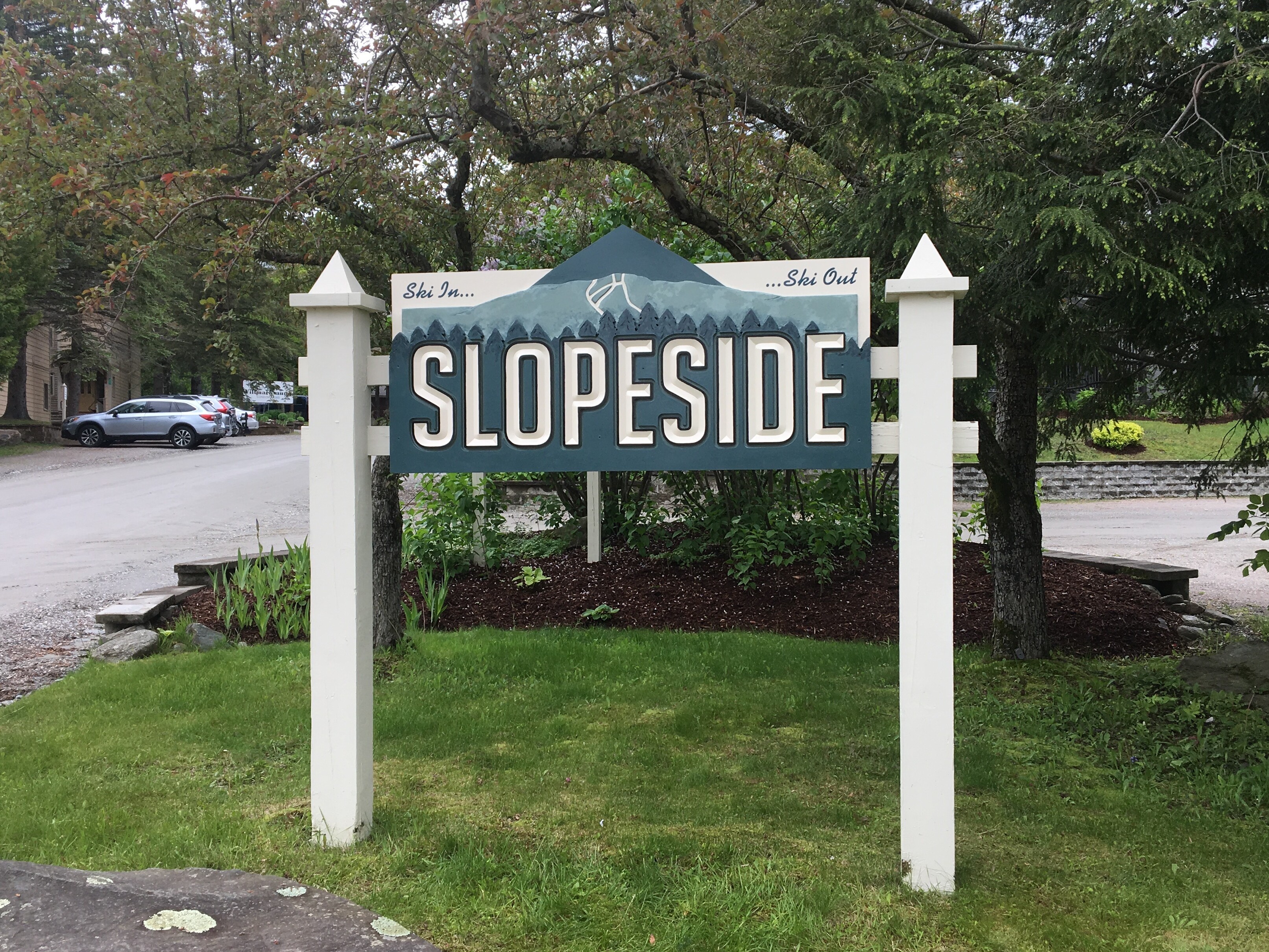
A carved sign is a sign where the lettering, borders, or logos are "V" grooved or straight routed into the wood, creating an indented effect. They can be used to create an illusion of depth or texture.
Carved signs can be made from a variety of materials, including wood, plastics, and metals. They're often used for office signs, building signs, and company signs and can be a great way to add a touch of elegance to your sign design.
Blade Sign
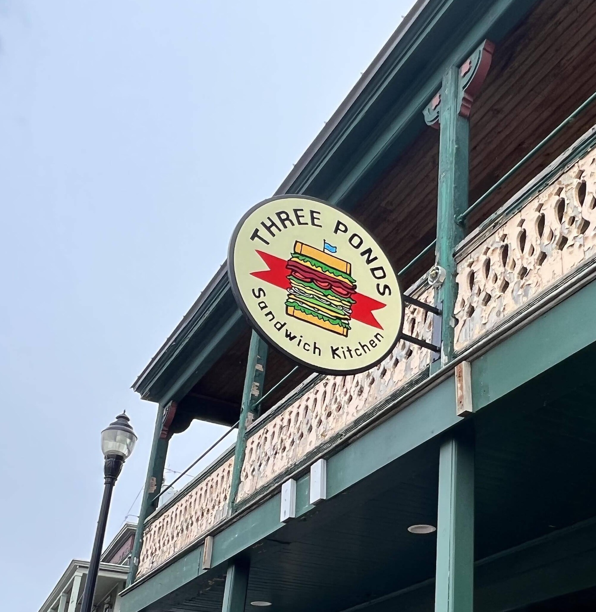
Blade signs project out from a building into pedestrian or street traffic flow. They can be hung from brackets or attached directly to the building.
A blade sign is an effective way to advertise your business and attract customers by prominently displaying your company name. These signs will create a memorable image for customers to remember long after they walk by your door.
With a well-designed blade sign, you can make a big impact without spending a lot of money!
Channel Letter Signs
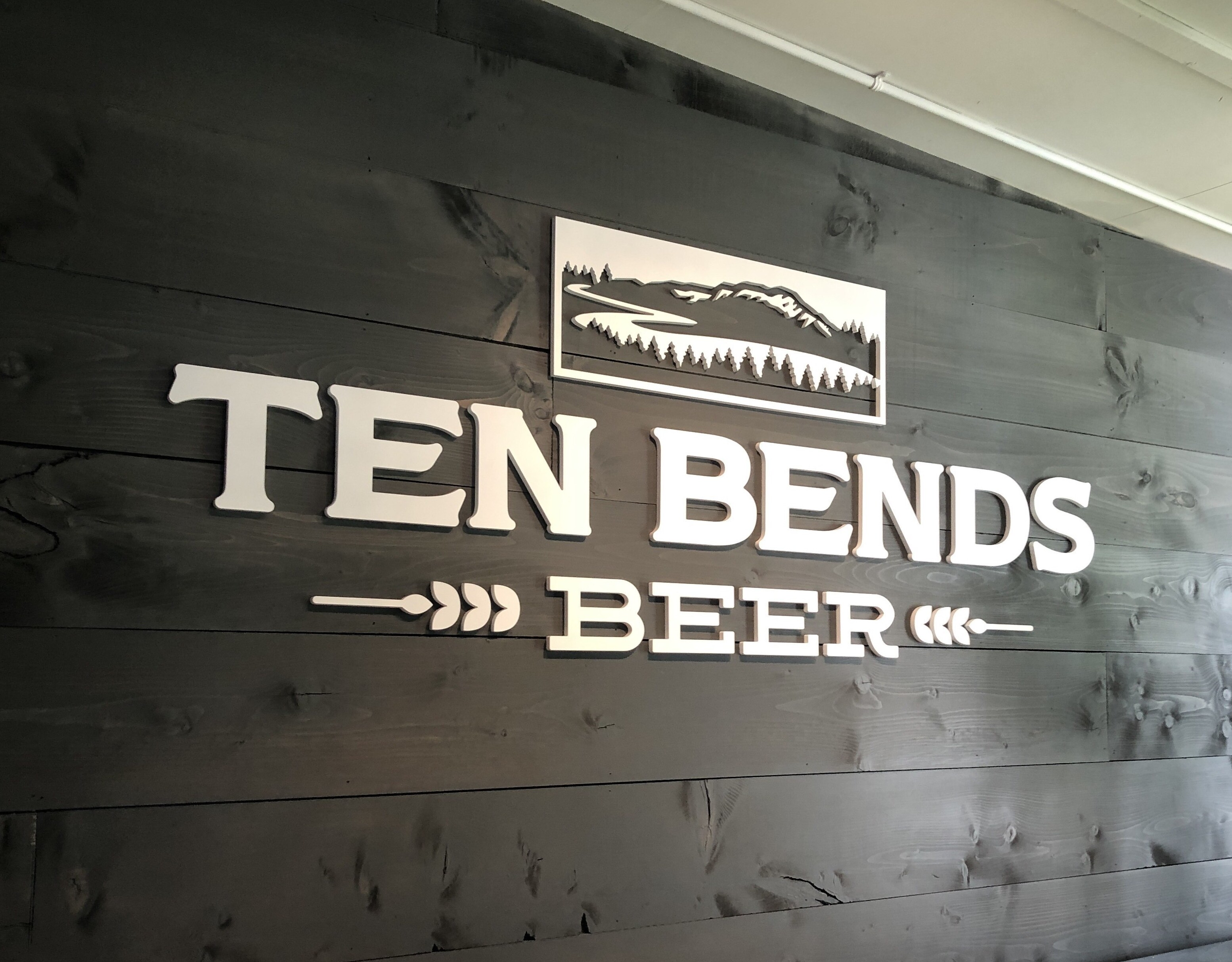
Channel letter signs are made up of individual letters that are mounted on a sign panel or directly to a building.
Channel letters are cost-effective because they are made from long-lasting, rust-resistant materials that can handle various weather situations. They're very noticeable and allow for plenty of customization options, so they'll fit right in with whatever style best suits your business.
Each type of business sign has its advantages and disadvantages, so choose the one that will be most effective for your business.
Choose The Right Materials For The Climate
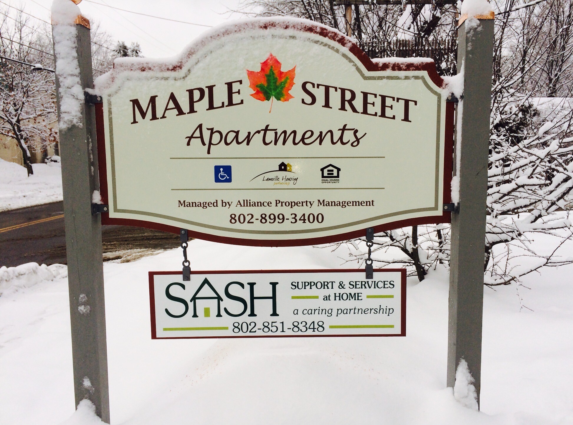
If you're in the market for a new sign, weather conditions should be one of your top considerations. After all, you want a sign to withstand the elements and continue looking its best, no matter what Mother Nature throws its way.
In general, materials like vinyl and polycarbonate are a good choice for colder climates, while aluminum is a better option for hot and humid environments. However, if you live in an area with extreme weather conditions, you'll want to choose a material that's specifically designed to withstand those conditions.
No matter what material you choose, make sure to invest in high-quality hardware that can stand up to the elements. By taking the time to choose the right sign for your business, you can rest assured knowing it'll continue looking great for years to come.
Work With Pros
With so much riding on your signage, it's important to work with a reputable sign company that can bring your vision to life. By investing in a well-designed sign, you're sure to make a great big impact on your bottom line.
Working with Great Big Graphics will save you time and money by getting the job done right, the first time. We have decades of experience in our industry and access to cutting-edge technology that will make your company stand out from competitors.
Work with the pros at Great Big Graphics!