Versatile Branding

A comment I hear often in the course of our work is “we heard all of our trucks have to be the same color or we’re not doing it right.” Well … yes and no. I’ll preach consistent branding with the best of them, but there’s also a point where you need to be realistic. What if you have several vehicles in your fleet but they aren’t all the same color? Are you already doomed to fail? I say, let’s make your marketing work for your circumstance by using versatile branding that is practical and affordable.
It isn’t always feasible or practical to purchase multiple vehicles all the same color. Maybe it’s the end of the year and there’s a killer sale but all that’s left is black when your other vehicles are white. Maybe your fleet is a mix of passenger vehicles and heavy equipment, and since most tractors come orange or yellow, making trucks and tractors matchy matchy would be super custom and very expensive.
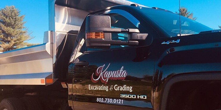
Better yet, establish a set of brand guidelines that will work for you. One recent project that put this notion to the test was lettering the two-vehicle fleet for Kapusta Excavating and Grading out of Wolcott, VT. Kapusta has been around a couple years, but the owner, Jim, had not yet taken the leap on branding himself, so we had the privilege of starting him from scratch. Right off the bat, I saw that Jim had two different color vehicles: A black and chrome dump body 3500, and a dark red Sierra pickup. A lot of marketing consultants will shake their heads at this setup. How can you establish consistent branding when your fleet is made up of different color vehicles? I like to look at this as a challenge. It’s not “how can Jim provide me with the perfect canvas to work with” but rather “how can I best work with the canvas Jim has to offer?”

My answer to this very common conundrum was to first develop a logo that is simple, readable, and versatile for a variety of mediums. Jim’s new logo can be used on vehicles, jobsite signs, business cards and a website with very little editing. The next step was to create a color scheme that ties the two vehicles together. One truck is black, and one is red. Why not incorporate both red and black into the logo? We used a base of metallic silver and white for both vehicles, then added accents of black on the red vehicle door, and accepts of red on the black vehicle door. The result is two coordinating vehicles, with lettering that clearly defines them as part of the same fleet, but that also works well with the background vehicle color. If next year Jim came to me with a new CAT Excavator he wanted lettered, I’d have a choice of either red or black for accent, and could even choose to incorporate a third accent color to the mix if it proved necessary. There’s little risk that the casual observer would look at that excavator, nor either of the trucks now on the road, and say “wait which company is that from?”
It all comes down to being smart, and using versatile branding that is practical and affordable.. Jim put his trust in us for that, and I feel pretty good about the result we were able to give him.
